Navigating around
· Accordion· Headerless Menu
· Breadcrumbs
· Directory Navigation
· Doormat Navigation
· Double Tab Navigation
· Faceted Navigation
· Fly-out Menu
· Home Link
· Icon Menu
· Main Navigation
· Map Navigator
· Meta Navigation
· Minesweeping
· Panning Navigator
· Overlay Menu
· Repeated Menu
· Retractable Menu
· Scrolling Menu
· Shortcut Box
· Split Navigation
· Teaser Menu
· To-the-top Link
· Trail Menu
· Navigation Tree
< Pattern index
Double Tab Navigation
Problem
The users need to navigate a hierarchical structureSolution
Use a double tabular to show the two topmost levels.
From
Use when
Sites where large amounts of pages are available and are hierarchically structured. The number of elements in the toplevel and in the second level each are less than 10. Users want to see where they are now. Users want to know how to get back to the main pageHow
Use a nested tabular to show the topmost level and one level lower. The current page is marked in both tabular and they are visually "connected". Additionally, use colors to indicate the selected tab. The topmost tabular is always visible while the other tabular changes depending on the current top-level selection. The first tab in the top-level is reserved for the home page if there is not any other "Home" destination.Why
The tabular metaphor is well-known in user interface and facilitates easy navigation between groups of information. By showing the current position in the two topmost levels the users know where they are and can also jump to other categories.More Examples
Dell's web site uses a more text-based double tab.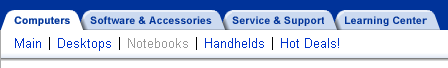

Comments

0 comments have been added to this pattern