Navigating around
· Accordion· Headerless Menu
· Breadcrumbs
· Directory Navigation
· Doormat Navigation
· Double Tab Navigation
· Faceted Navigation
· Fly-out Menu
· Home Link
· Icon Menu
· Main Navigation
· Map Navigator
· Meta Navigation
· Minesweeping
· Panning Navigator
· Overlay Menu
· Repeated Menu
· Retractable Menu
· Scrolling Menu
· Shortcut Box
· Split Navigation
· Teaser Menu
· To-the-top Link
· Trail Menu
· Navigation Tree
< Pattern index
Icon Menu
Problem
Users need so make a selection out of a limited set of itemsSolution
Allow users to select a menu item by selecting an image and display the label in a fixed location.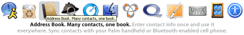
From www.apple.com
Use when
The space for the menu is limited or when icons can be used effectively.How
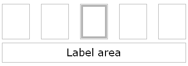
The icons are lined-up or placed into a convenient configuration (e.g. 3 by 3 or next to each other). Users can move the focus or mouse-pointer over these icons. The icon that is selected will be visually shown distinct from the others. while an icon is selected the label is shown in the 'label-area' which is usually above or below the icons.
Why
This type of menu emphasizes icons while it is at the same time very compact. Especially in special circumstances with limited screen-space, e.g. mobile phone menus, this can create very effective menus.More Examples
The SonyEricsson T68 uses an image menu as the main phone menu. The users can use a mini-joystick to select a menu item. The 3 by 3 arrangement corresponds with the keypad arrangement (the 1-9 keys) which work as shortcuts for the menu items.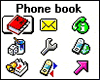
Example of www.NPK.nl
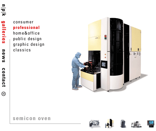

The screenshot is a good example how it should not be done.
The text-navigation is too prominent and the icons have no label. They are so seamlessly integrated that it nearly appears to be a part of the design.