Dealing with data
· Carrousel· Table Filter
· Details On Demand
· Collector
· Inplace replacement
· List Builder
· Overview by Detail
· Parts Selector
· Tabs
· Table Sorter
· Thumbnail
· View
< Pattern index
Carrousel
Problem
The user needs to select an item out of a set of itemsSolution
Show the items by their visual representation in a circular fashion so that one item can be selected at a time.
From
Use when
The items need considerable space to display, usually because the are displayed as an image. At the same time the space for the items is limited. Typically only enough for 5-8 items. The set of items shouldn't be to large because otherwise it takes to long to select the item. Do not use for more than 3x times the amount of items that are visible at one time. Can be part of an Image BrowserHow
Align all items horizontally or vertically so that a 'strip' of items is created. Then show only some items of the strip and hide all the others. Place arrow buttons at both ends of the strip so that the user can move the visible area. Highlight the one that is currently selected. In order to improve usability make each item selectable and move the strip so that the selected item is in the middle. Also support keyboard navigation. Use some animation to make the sliding effect of the strip look nice.Why
Because the carrousel only shows some items at a time, you only need a small space to show many items. Because the carrousel is circular, users can reach items either by going left or going right.> Although the word 'carrousel' implicates a circular structure, many carrousels are not circular. It then becomes a 'sliding window' over a strip.
More Examples
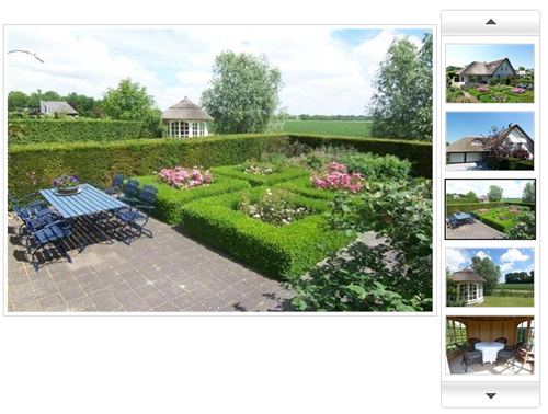
, a Dutch real-estate site, uses a carousel as part of an Image Browser:
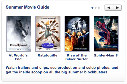
At a non-circular carrousel is used. Also not the 3 dots next to the arrow keys that act as a 'you are here' indicator:


Because of space contraints - they decided to put 6 items in the carousel rather than 5 - the previous/next arrows were consigned to the upper right corner of the block (like your summer movie guide example above,, but much smaller). I'm sure I wasn't the only person who missed them for months, and saw only a grid of images.
It would be interesting to know which is the most visible home for arrows: to the side, above/below, etc...
Another thing that could help is to ad some animation to show users that there are actually many more items.