Dealing with data
· Carrousel· Table Filter
· Collapsible Panels
· Details On Demand
· Collector
· Inplace replacement
· List Builder
· List Entry View
· Overview by Detail
· Parts Selector
· Tabs
· Table Sorter
· Thumbnail
· View
< Pattern index
Collapsible Panels
Problem
Users need to access information or functionality but they only need in under certain (temporal) circumstancesSolution
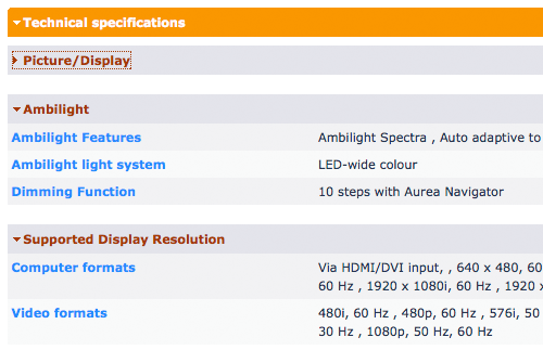
Create panels that can be opened or closed independently of each other
From
Use when
When a lot of data or a lot of functionality is available, users typically only need a certain subset at any given moment. In order to keep the screen clean, it is preferred to show only the core information or functionality, and hide the rest but make it available on demand. Hence, Collapsible Panels are often used in a Web-based Application. If Tabs are used the amount of screenspace will typically be large which may lead to awkward pages.How
Stack several panels on top of each other and give each panel a label. The label should be clickable and toggles between the expanded and collapsed states of the panel. In order to make this behavior clear to the users, an arrow pointing to the right (collapsed state) or down (expanded state) can be used. The arrows are commonly used in Mac OS X and many Adobe applications so they may be somewhat familiar to users. Alternatively, double arrows up or down, or plus and minus symbols, are sometimes used as well. Use a transition animation if possible to give users feeback of the expanding/collapsing process.Why
Basically Collapsible Panels are similar to a Accordion but now with the possibility to keep entire sections open. Whereas Details On Demand shows only information regarding one item, Collapsible Panels can be seen as an extension to hide and show larger chunks of information or functionality. Collapsible Panels are very space efficient as they are no larger than they have to be. When the number of panels you have is low, consider Tabs but that may be less space-efficient. When used in the main navigation, Collapsible Panels become nearly identical to Navigation Tree but then with only 1 level.The main downside of Collapsible Panels is that they are not that common and may confuse less experienced users. They are common in desktop applications such as in Adobe CS3 but in web applications they are less common. Another issues is deciding what the default state of each panel should be since some may be expanded and others collapsed. Deciding on this issue requires good insight into your users' needs.
More Examples
 Google uses Collapsible Panels on their iGoogle pages.
Comments

0 comments have been added to this pattern
