Language Selector
Problem
Users need to select their prefered languageSolution
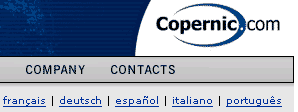
Ask the language spelled in the specific language
From www.copernic.com
Use when
If a website offers different content for each particular country, the site is localized. Hence, language is often one of the things that are localized. Users must be able to recognize their language name. Users might be able to read more than one languageHow
List all the available languages in their own spelling such as "Deutsch", "English", "Italiano" or "Nederlands". If possible, list them all so that selection can happen in one click. Otherwise consider a combobox. Do not use any label for the language selector, just provide the names of the language. Place the list of language in the upper part of the window and show it on every page of the site.NOTE: Do not use flags to present languages! They do not uniquely define languages and can be very offending in some countries! Flags represent countries and not languages.
Why
Presenting the language in native spelling makes sure that the target group can read their own language name. Providing a label would not make sense: if the users can read it they do not have to change the language, otherwise a label they do not understand does not tell them anything. The language selector must be available on all pages of the site so that visitors that have not entered the site via the home-page can also switch language.More Examples
The Speednames site offers so many languages that it even consumes a prominent position on the homepage.

As far as examples are concerned, I think www.apple.com homepage has one of the most unfriendly selectors I have come across.
Thanks!
If I want to switch the site to another language then shown, it means that I can't read the current version. Because of that, I probably can't read the currently selected language label either. Maybe some recognisable icon next to the listbox could solve this?
Personally, I don't like sites where language selectors are localized, but this could be because I don't have a problem reading/writing English and I usually prefer English sites to Dutch (native) ones since translations often fail.
A flag is generally a recognizable icon, but in our business we can't use flags due to cultural concerns associated with using a Taiwanese flag to represent Chinese (Traditional). We use a globe instead, but I think the GE World Map icon is a little clearer and the top right positioning means it doesn't get lost at the bottom of long scrolling pages, as it does on other sites.