Page types
· Article Page· Blog Page
· Case Study
· Contact Page
· Forum
· Guest Book
· Homepage
· Newsletter
· Printer-friendly Page
· Product Page
· Tutorial
< Pattern index
Homepage
Problem
Users need to understand if they are at the right place, and if so, how they can move on to accomplish their task at your siteSolution
Create a home-page that introduces the site to users and that helps them to get on their way on the site
From
Use when
Every website has a home-page. It is like the front door of your house. For most users, it will be the starting point for navigating through your site. Typically, the home-page will be your most requested page of the entire site.How
The home-page is an important page, it is the front door of your site. Users that found your site intentionally need feedback to confirm that they are in the right place. For other users that don't know you very well, you need to make clear who is behind the site and what there is to find. The home-page is often packed with stuff, but although it is ok to indicate what the site is about, putting a lot of stuff on the page is not always good. When links are buried in a christmas tree of page elements, users will not notice it. The home-page must balance navigation, branding, content, and promotion elements. Be careful not to make your page too full, users can only notice a couple of things at a time.On a more conceptual level, the home-page has three functions:
- Introduction The site must be introduced, both its purpose and identity. Users must know almost immediately what the site is for and who is behind it. This can be done in several ways. For example using a tag-line or pay-off. A tag-line is a short "one-liner" that makes it clear what the site or company is about. Identity can also be established using photography or by showing the company's logo, If identity cannot be established well visually, you can always add a short explanation. Animation can also be used to literally show who you are and what you do. For very well known brands, the introduction can be very short, just a logo and nothing else, e.g. nike. For unknown brands or sites with a highly specialistic purpose, a textual introduction is best. Another aspect of establishing an identity is having an About Us reachable from the Meta Navigation.
- Entrance . Users seldom find what they need on the home-page. Therefore, the site's Main Navigation must be clearly shown. On the home-page so that users know where to get started. Besides the usual menu bar, you can also use special home-page navigation such as a Doormat Navigation. Other important elements include a Search Box, Login if needed and so on. For international site a Language Selector or a Country Selector. Next to the navigation, a home-page often also reveals so content from somewhere within the site. This can help to make users understand what the site is about and in some cases even
- Announcement On most sites, things happen and the site changes. The home-page is to place to communicate what is new, what is going on, new promotions and so on. Use a News Box for general news, or special news blocks for things like Case Study.
The home-page is a special page. It is therefore quite normal that it has a slightly different layout than the other pages of the site. Nonetheless, some level of consistency should be retained so that the home-page and other pages clearly "belong" to the same site!
Why
The home-page is all about making a first impression.More Examples
This example from is a good example of a very "empty" page. The Nike brand is so strong that they don't need to spend much words to establish identity. The navigation is very clear and users easily find their way.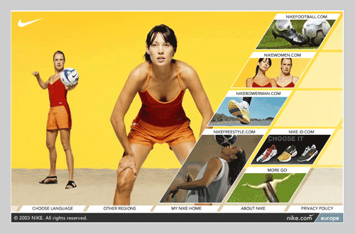

Comments

0 comments have been added to this pattern