Navigating around
· Accordion· Headerless Menu
· Breadcrumbs
· Directory Navigation
· Doormat Navigation
· Double Tab Navigation
· Faceted Navigation
· Fly-out Menu
· Home Link
· Icon Menu
· Main Navigation
· Map Navigator
· Meta Navigation
· Minesweeping
· Panning Navigator
· Overlay Menu
· Repeated Menu
· Retractable Menu
· Scrolling Menu
· Shortcut Box
· Split Navigation
· Teaser Menu
· To-the-top Link
· Trail Menu
· Navigation Tree
< Pattern index
Main Navigation
Problem
Users need to know where they can find what they are looking for.Solution
Place an always visible menu at a fixed position on the page. Support this main menu with additional navigation tools.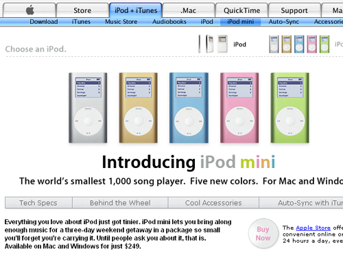
From
Use when
All sites need some form of main navigation.How
There are dozens of ways to design the main navigation for your site. However, the most common ones are the Horizontal Menu and Vertical Menu or Inverted L Menu. The choice for a particular navigation system must be based on the information architecture for the site. When chosing a navigation type its benefits and its limitations must be balanced with the constraints on the information architecture, other page elements and visual constraints.Horizontal Menu
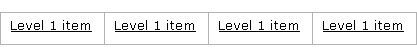
A horizontal menu usually consists of a horizontal bar with several clickable items placed at the top of the page. The navigation stays unchanged when browsing through the site and it is present on every page. The currently selected item is usually highlighted is some way: by making the text label bold or by changing the back- and foreground colors. If the information structure has several levels, consecutive levels can be placed underneath the previous level, showing the cascading path down the hierarchy. If you have 2 levels you get what is also known as a Double Tab Navigation
In relation to the information structure, it is important to realize that top navigation has some important limitations:
- The maximum number of items is 6 to 8 items depending on the average word length, the font size and browser size you are designing for. If you expect the number of items to grow over time, keep in mind that you cannot expand very much. If you really have to, you have to re-organize the information structure so that it fits again. However, this might be conflicting in your intention to provide a goal-optimized information structure.
- The number of levels that you can show is limited to 2 or 3. Since each level is placed underneath the previous level, a lot of vertical space is used that pushes down the content area. So if you envision 3 levels, you need to reserve vertical "white space" for the navigation to expand.
One of the main advantages of top navigation is the fact it does not consume vertical space and thereby maximizes the width of the content area. Often the content area itself is split up in a main content area and a column with related information. This is even recommendable since text is more readable when the column is not too wide, leaving space for the second column.
Vertical Menu
An other often used navigation scheme is to used left navigation, sometimes also called vertical navigation. When left navigation is used, the page is split in at least 2 columns where the left column is used to place the navigation. Several forms are often used: (A) showing only level 1, (B) showing level 1 and expanding level 2 when selected, and (C) showing level 2 grouped by a non-clickable level 1 heading.
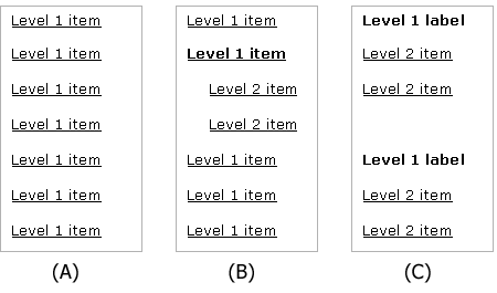
If type A is used, subsequent levels must be shown in an additional way, for example using Breadcrumbs. Type B shows the second level although only one level 2 section is shown at one time. A variation on type B is the use of Fly-out Menu to display level 2 items. Type C is the only one that shows all level 1 and level 2 items at the same time.
Left navigation has two main disadvantages:
- Depending on the type, navigation items are pushed down the page, which leads to more scrolling. This may cause several level 1 items to become invisible unless scrolling is used.
- When an item 'under the fold' is selected, the highlighted item is not visible because it is under the fold. This situation requires other means of telling the user what the current selection is.
A minor issue concerns headings in the content. In left navigation the headings can be placed at the top of the content area which is also the top of the page. In top navigation, the heading will have to be placed underneath the navigation itself. It often looks visually less appealing because the same words appear directly on top of each other. This becomes worse when 2 or more levels are shown in the top navigation.
Inverted L Menu
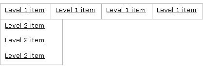
In practice, the main navigation must deal with levels 3 and 4 in the information structure. Usually it is more 'attractive' to use a combination of horizontal and vertical navigation. Horizontal navigation can be used for the level 1 items while vertical navigation is used for level 2 and 3 items.
It is also possible to use left navigation for the first level and then proceed with top navigation, although this is rarely used. Starting with top navigation is often a better choice; typically the number of items of the first level is small while it usually expands on lower levels.
What is essential for a top-left navigation, is the type of left navigation. Considering the limitations of left navigation it may still be problematic to show enough items. If so, consider a more rigorous approach such as Split Navigation. For level 4 navigation, the variations that are possible for either horizontal or vertical navigation can also be applied. Inverted L navigation is one of the more flexible navigation schemes and is hence also useful if a site has sub-sites. The horizontal navigation can be used to access the independent sub-sites while each sub-site uses left navigation locally.
Other menu systems
There are many more possible menu systems. Some are variations on the horizontal or vertical menu, e.g. Fly-out Menu or Headerless Menu. Others are more image oriented or suitable for very specific cases e.g. Scrolling Menu, Doormat Navigation, Faceted Navigation or Minesweeping.
Additional navigational tools
The site's main navigation is almost never the only way to access the information. Site Map, Site Index and search functions also allow users to reach the information. These navigational tools are supportive in the sense that they exist together with the main navigation itself. Only sites that are search engines themselves will use these supportive tools as the main navigation.
The main navigation may also be supported by other tools such as a Repeated Menu and Meta Navigation.
Why
The site's main navigation is the main way to make the information accessible for your users. The navigation helps users to go through the information structure of the site and tells them where they are and where they can go. That experience will 'educate' users about the structure of the site and help them to be more effective in their activities. Since most sites are primarily hierarchical, the navigation helps the users go up and down that hierarchy or navigating on the same level. Nonetheless, adding cross-links to the hierarchy can help to make relevant information available when it is needed, even if it is placed in another branch of the hierarchy.More Examples
At a simple vertical menu is used: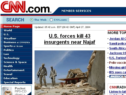
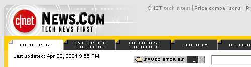
At a nice horizontal menu is used:
At a variant of an inverted L menu is used. The horizontal menu is combined with a Fly-out Menu and then followed by a simple vertical menu:


Comments

0 comments have been added to this pattern