Basic interactions
· Action Button· Guided Tour
· Paging
· Pulldown Button
· Slideshow
· Stepping
· Wizard
< Pattern index
Wizard
Problem
The user wants to achieve a single goal but several decisions need to be made before the goal can be achieved completely, which may not be know to the userSolution
Take the user through the entire task one step at the time. Let the user step through the tasks and show which steps exist and which have been completed.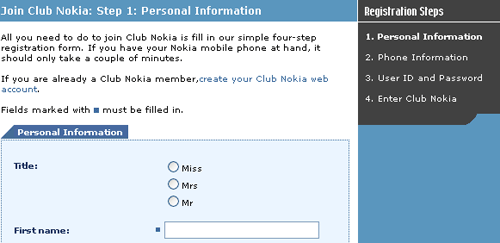
From
Use when
A non-expert user needs to perform an infrequent complex task consisting of several subtasks where decisions need to be made in each subtask. The number of subtasks must be small e.g. typically between ~3 and ~10. The user wants to reach the overall goal but may not be familiar or interested in the steps that need to be performed. The task can be ordered but are not always independent of each other i.e. a certain task may need to be finished before the next task can be done. To reach the goal several steps need to be taken but the exact steps required may vary because of decisions made in previous steps.How
When the complex task is started, the user is informed about the goal that will be achieved and the fact that several decisions are needed. The user can go to the next task by using a navigation widget (for example a button or some other form of Paging mechanism). If the user cannot start the next task before completing the current one, feedback is provided indicating the user cannot proceed before completion (for example by disabling a navigation widget). The user is also able to revise a decision by navigating back to a previous task.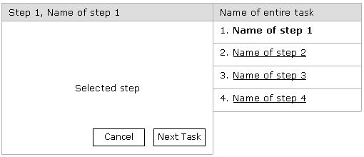
The users are given feedback about the purpose of each task and the users can see at all times where they are in the sequence and which steps are part of the sequence. When the complex task is completed, feedback is provided to show the user that the tasks have been completed and optionally results have been processed.
If relevant, users that know the default options can immediately use a shortcut that allows all the steps to be done in one action. At any point in the sequence it is possible to abort the task by choosing the visible exit.
Why
The navigation buttons suggest the users that they are navigating a path with steps. Each task is presented in a consistent fashion enforcing the idea that several steps are taken. The task sequence informs the user at once which steps will need to be taken and where the user currently is. The learnability and memorability of the task are improved but it may have a negative effect of the performance time of the task. When users are forced to follow the order of tasks, users are less likely to miss important things and will hence make fewer errors.More Examples
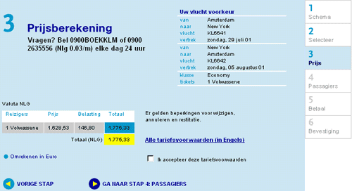
This example is taken from the KLM web site where you can buy tickets online.

Comments

0 comments have been added to this pattern