Shopping
· Booking· Product Comparison
· Product Advisor
· Product Configurator
· Purchase Process
· Shopping Cart
· Store Locator
· Testimonials
· Virtual Product Display
< Pattern index
Purchase Process
Problem
Users want to purchase an already selected productSolution
Present users with the purchase steps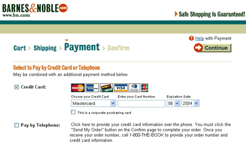
From
Use when
The site allows purchasing of goods, typically a E-commerce Site but it can also a site that happens to sell products as well such as a Museum Site. A purchase can also be part of larger tasks such as a Booking.How
In order to purchase the products in the cart they need to select the checkout action. The checkout is a five step Purchase Process with the following tasks:- Identify they client
- Select shipping address and special options
- Select payment method
- See overview of the entire order
- Confirm and place order
- Receive confirmation by email
Minimize navigation and non-relevant page elements
Since purchasing is a task that requires quite some focus, the standard page layout during the purchase process has to be simplified. Sub-navigation and contextual elements should not be shown. All distracting elements should be removed.
User Login
Many sites require users to Login as the first step of the process. While this is convenient for returning customers because all their personal data can be re-used, it is not very nice for new users. New customers should be allowed to purchase items without creating an account. At the end of a purchase, users can be asked to Registration. Registration can then be made very simple because all the basic data has already been captured during the purchase process, only the username and password still needs to be selected.
Confirmation by email
It is important to 'give' the users something that is easily accessible after the browser has been closed. An email with the information about the purchase is like a 'receipt' for users. It should contain an order number, list of items in the order, all amount, shipping address, payment information, date of placing order. It should also contain help for users how to track they order, cancel it, or request assistance.
Why
First time customers or infrequent customers are best helped with a Wizard that allows the to complete the purchase in small steps. Returning customers usually use the same shipping address and same credit-card. Therefore the process can be more efficiently done in only one overview screen with a 'purchase' button.More Examples
At Amazon, the wizard is not shown for frequent customers who's data has been stored already. All information is shown in one screen while still allowing users to change parameters: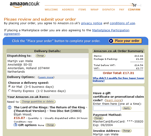

Comments

0 comments have been added to this pattern