Form
Problem
Users need to provide personal information and send it to a service providerSolution
Offer users a form with the necessary elements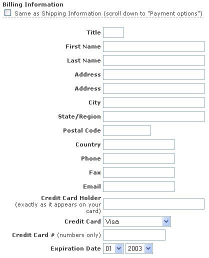
From www.iht.com
Use when
Users need to provide information. In many occasions, there can be a need for users to give information via a site. For example, when Booking a flight, using an Advanced Search, when doing a Registration on a site, doing some online tax calculations, or simply to Login. Giving particular information must be part of a user task or at least provide benefit for the endusers.How
A form is essentially a collection of labels and input fields on a single page. When designing forms, the following issues must be taken into account.Wording. Make sure that users understand what you are asking from them. Realize that there are internationalization issues here, e.g. "state" is only for US, "title" can be easily misinterpreted. Give examples to re-enforce the meaning of the field. Put examples below or at the right of the input field. Use prompts sparely, adding more text also increases the chance that people won't read it. So keep any form of introduction text short, no more than a couple of lines.
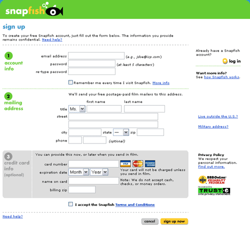
Grouping and ordering. Place elements in a logical ordering and group fields that together describe an entity, e.g. name and address could form "personal information".
Basic Form Wireframe
Layout of label and input elements. Use grids, put the label left of the element or above it there are sever space limitations. Right align the label with the field so that label and field are always closely together. Both the labels and input elements must be aligned using Grid-based Layout. Design in one column only, avoid having multiple input elements on the same line. Only do that if an entity is sensibly split up in part for which you need separate input elements. The length of text input fields must be determined by the information that needs to be supplied. However, keep in mind that this can vary because of internationalization issues as well. A surname in the US is usually quite short (one or two words), but in Spain they use much longer surnames (three to six words is not uncommon).
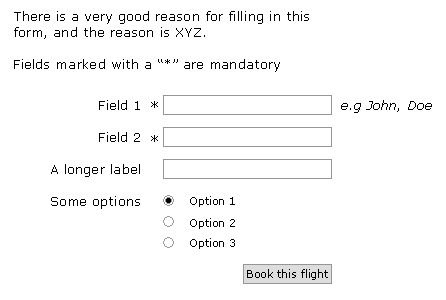
Mandatory and optional fields. In general making a distinction between mandatory and optional fields is a bad idea. Users should never have to fill in anything that is not required for the task at hand. However, there are certainly exceptions where optional fields make sense. In such cases it is important that it is clear to the user how filling in these fields will benefit them. For example, so that recommendations can be improved or so that the service can be improved (supporting multiple shipping addresses). If you have mandatory fields AND optional fields, mark the mandatory fields with an asterisk "*". If the users submits the form but not all mandatory fields have been filled in, show a popup that says which fields (still) need to be filled in. Also add a privacy statement....?
Using the right input element It is important to use the right input element for a certain field. This depends on the number of options, single/multiple choice, and the sort of information that is required. For selecting elements from fixed sets use:
Single Choice from a fixed set: (e.g. number of guests,)
- less than 5 options: radio buttons
- 5-10 options: a list box
- more than 10 options, listbox or editbox or a special control
Alternatively, use edit boxes and check afterwards if the input has been interpreted correctly. For example www.ns.nl
Good defaults In order to speed up data entry, it is often good to use appropriate default values. However, do not use default values for sensitive fields such as "gender".
Preventing input errors Consider Constraint Input to make sure users cannot provide invalid input. Otherwise, validate the data and give an Input Error Message. Be aware that validation is not always 100 percent waterproof, e.g. it is simply not possible to verify that an email address is valid by checking it syntactically.
Keyboard navigation Filling in forms is tedious and it goes much faster if you can use the keyboard to go from one field to the other. Make sure that the TAB key can be used to do this and that the ENTER key is a shortcut for "confirm", submit, save etc. When the page is loaded the cursor should be already in the first field and it should have the focus so that users can start typing straight away. Using the tab key users go to the next item in the form, i.e. the element to the right or below the current element.
Why
Filling in forms is error-prone and things must be made as clear as possible for users. Using the right labels, widgets and defaults all contribute to the successful completion of the form.More Examples

You could call this the "Confirm Form" pattern perhaps.
Thanks.
So what should be the shortcut when a user is in the TEXTAREA and want to submit the form?
Thanks.
http://www.bemba.com/signup
Is it really neccesary? The risc of accidental use is big, so why not leave it out?