Grid-based layout
Martijn van Welie
The user needs to be able to scan, read and understand a page quickly
You are designing a conventional website that needs to follow the normal visual design standards. This pattern does not necessary apply to artistic web sites where the goal is to display an explicit non-standard style. The human eye 'sees' a web page a certain way, roughly from the top left to the bottom right, and the eye can be guided to see elements in a pleasing and distinctive way.
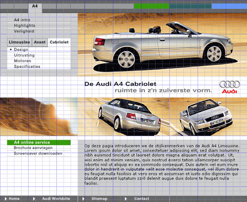
From
www.audi.nl
Use a grid system for the placement and alignment of all visual objects on the web page
A grid is a technique that comes from print design but easily be applied to web design as well. In its strictest form a grid is literally a grid of X by Y pixels. The elements on the page are then placed on the cell border lines and overall aligned on horizontal and vertical lines.
A grid is a consistent system for placing objects. It works on two levels:
- At the unit level of cells (e.g. 20x20 pixels) See for example the Audi example above where a strict underlying grid is used for all elements on the page. In print design such grids are called 'modular' grids
- At the column level (e.g. 4 columns) See for example the Abn-amro example below where a grid is used for defining the overall layout in terms of columns and margins. In print design such grids are called 'column' grids
In literature for print design, there are many variations of grids described but most are based on modular and column grids. Often you'll encounter a mix of both types of grids.
A grid is an aid for the designer, not a goal by itself. It is therefor ok when some elements are deliberately NOT placed on a grid to create a certain effect. The grid simply creates some rhythm and guidance for the eye.
The grid creates a systematic and consistent rule for placing objects. It creates a visual rhythm. It makes it easier and more pleasant for the eye to scan the objects on the page. Page designs that do not use a grid often tend to look 'messy' or 'unprofessional'.
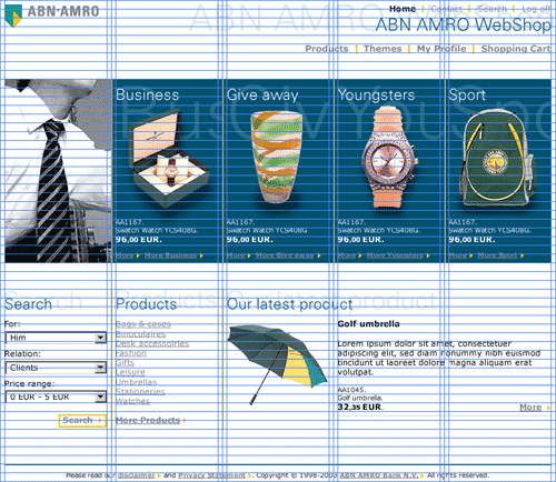
In this example from the Abn-Amro shop you can see a different type of grid being used. Not a strict modular grid, but a grid defining some columns, margins and horizontal evenly spaced guides.
From more information on different types of grid systems and when to break the grid system, see the book "Making and Breaking the Grid" by Timothy Samara.